
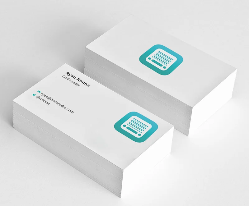
Your business card is often the only thing a new contact takes home, so the paper matters as much as the design. A heavier stock says quality before anyone reads a word.
Matte is the safe choice. It has no glare, takes a pen well and makes colours look calm and modern. It is ideal for consultants, therapists and anyone who likes to write a note on the back.
Gloss makes photographs and saturated colour pop. It suits photographers, restaurants and retail, but it is hard to write on and shows fingerprints.
Uncoated stocks feel natural and slightly textured. Pair them with simple type and a limited palette for a craft or heritage look.
Whichever you pick, look for at least 16 pt (350 gsm). Thinner cards bend in a wallet; thicker ones feel premium. Each product in our shop lists the exact stock it is printed on.

Leave a Reply